Tianyu, on the whole, each of these would benefit from you considering the composition and using no line.
Day 1 good work exploring spiky and brittle. Here you are demonstrating that you can describe complex form using expressive tone. Good work revealing 3D surface and planes. You might add a bit more mid grey tones between your light grey and black marks. You are still relying on line a little too much. In the future have the courage to use no line, no contours at all. And it will be even more successful. Make sure that you include the negative space in your tonal consideration so that this reads more like a ‘finished composition’ rather than a ‘sketch’.
Day 2 Soft and Pliable shows competent form, good work doing this, but it would benefit from pushing the marks to really communicate soft and pliable and including negative spaces in your tonal pattern. The surface here can be softened a great deal, try using your eraser as a drawing tool. Create closure with your eraser by opening up some of the lines you used to create the profile.
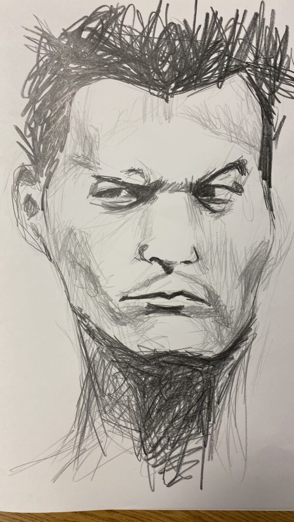
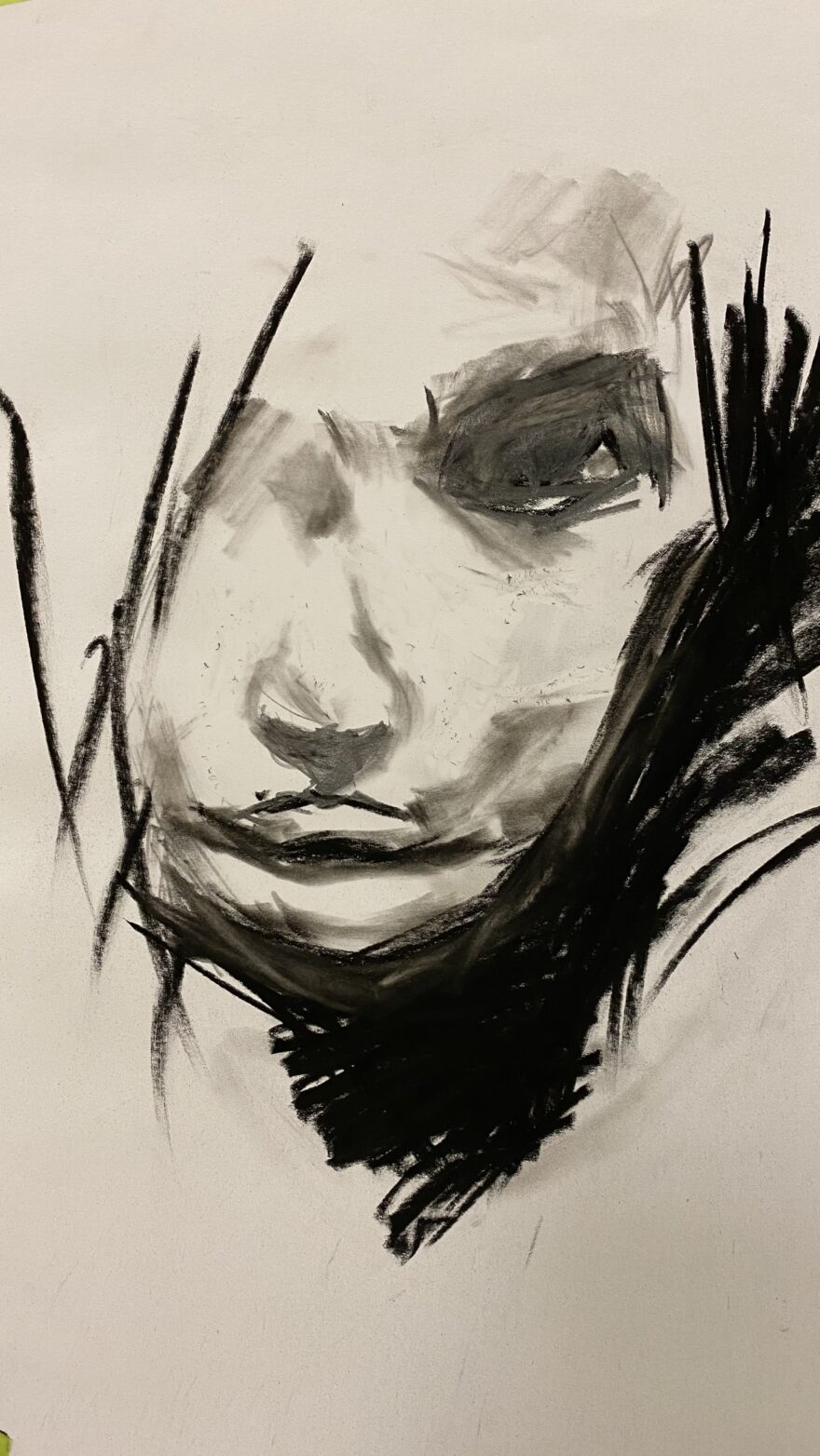
Day 3 Creepy and Sinister is not creepy or sinister. This form is not accurate, it is a stereotype and is anatomically problematic, for example, extremely exaggerate huge eyes. The vertical lines might have been successful if they really had followed the topography of the surface of the face. You have not considered negative space and have used instead an outline.
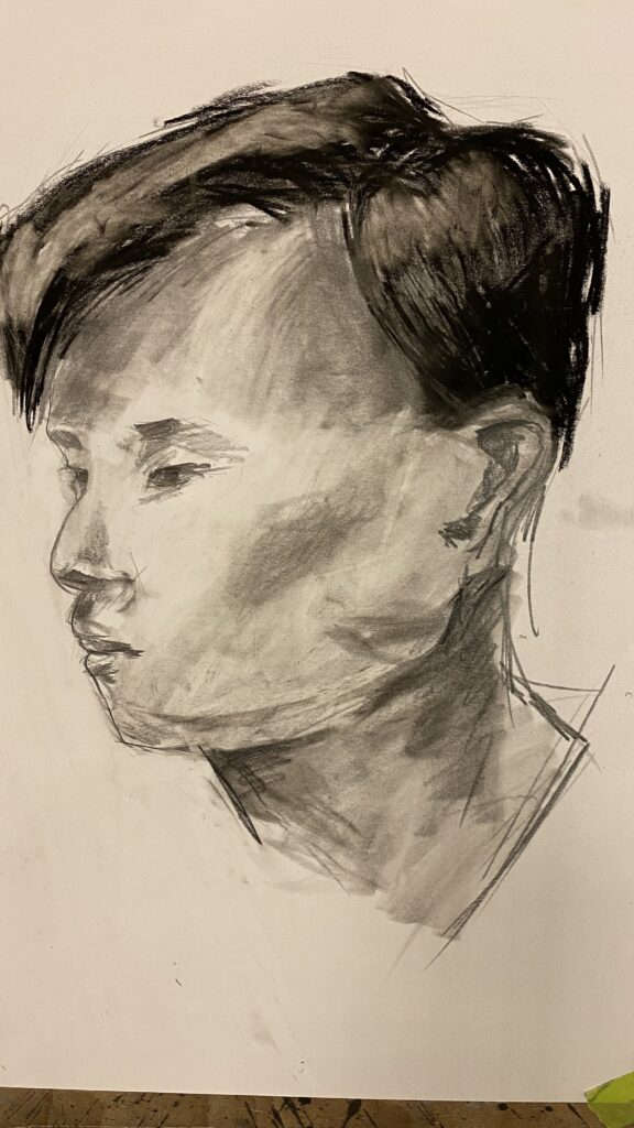
Day 4 good work not using an outline. This is much better. It is beginning to be more anatomically correct, show some volume and use expressive dramatic mark making. Try cutting through the diagonal gestures on the left with an eraser to allow the face to dissolve a little into the white of the page.
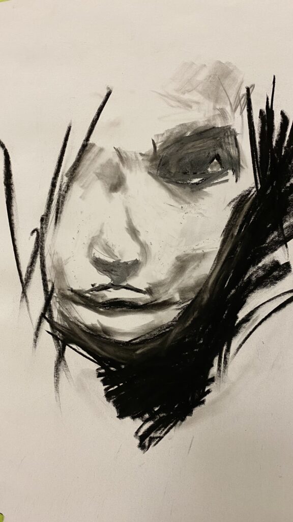
Day 5 These are rendered using continuous tone and scribble tone and both are additive. For Subtractive tone you tone your paper with charcoal powder or soft charcoal on your hand or a soft cloth. Then you use your eraser to pull out the values and create a range of values.
Include negative space in all of these so they read more like finished compositions that balance tonal expressiveness with accurate form.

Tianyu, on the whole, each of these would benefit from you considering the composition and using no line.
Day 1 good work exploring spiky and brittle. Here you are demonstrating that you can describe complex form using expressive tone. Good work revealing 3D surface and planes. You might add a bit more mid grey tones between your light grey and black marks. You are still relying on line a little too much. In the future have the courage to use no line, no contours at all. And it will be even more successful. Make sure that you include the negative space in your tonal consideration so that this reads more like a ‘finished composition’ rather than a ‘sketch’.
Day 2 Soft and Pliable shows competent form, good work doing this, but it would benefit from pushing the marks to really communicate soft and pliable and including negative spaces in your tonal pattern. The surface here can be softened a great deal, try using your eraser as a drawing tool. Create closure with your eraser by opening up some of the lines you used to create the profile.
Day 3 Creepy and Sinister is not creepy or sinister. This form is not accurate, it is a stereotype and is anatomically problematic, for example, extremely exaggerate huge eyes. The vertical lines might have been successful if they really had followed the topography of the surface of the face. You have not considered negative space and have used instead an outline.
Day 4 good work not using an outline. This is much better. It is beginning to be more anatomically correct, show some volume and use expressive dramatic mark making. Try cutting through the diagonal gestures on the left with an eraser to allow the face to dissolve a little into the white of the page.
Day 5 These are rendered using continuous tone and scribble tone and both are additive. For Subtractive tone you tone your paper with charcoal powder or soft charcoal on your hand or a soft cloth. Then you use your eraser to pull out the values and create a range of values.
Include negative space in all of these so they read more like finished compositions that balance tonal expressiveness with accurate form.