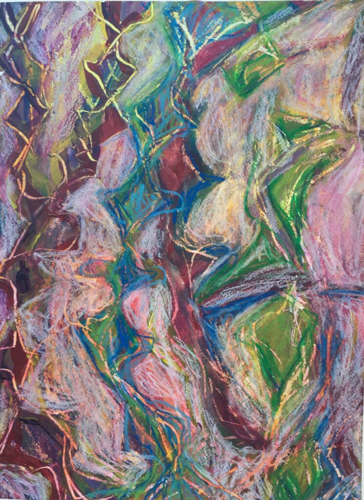
This is a series of works inspired by natural filters found in my environment. I photographed reference images through these filters, and then began to form a composition on paper with oil pastels, and layers of acrylic paint. This was an exciting project because the drawings were small and I felt free to experiment wildly without risk of being disappointed with a large project. (I know it is good to experiment on a large scale as well, but small is less daunting).
An experiment I am excited with the results of can be seen in two of the paintings in which I broke rules by thickly painting acrylic over oil pastels. This is not a usual practice because the water-based acrylic does not mix well or stick firmly on top of oil. I used this reality to my advantage by scratching, rubbing in and peeling the upper layers of acrylic paint to create surprising surfaces. I love the areas with vibrant pastels peeking out from the paint.
Several of the filters are indistinguishable or too complex to describe, so I won’t say what I used. But a couple of these pieces are named after the filters.
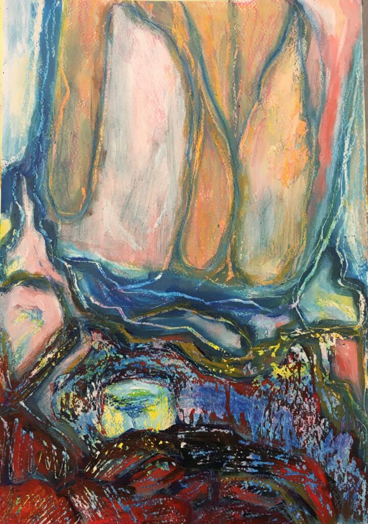
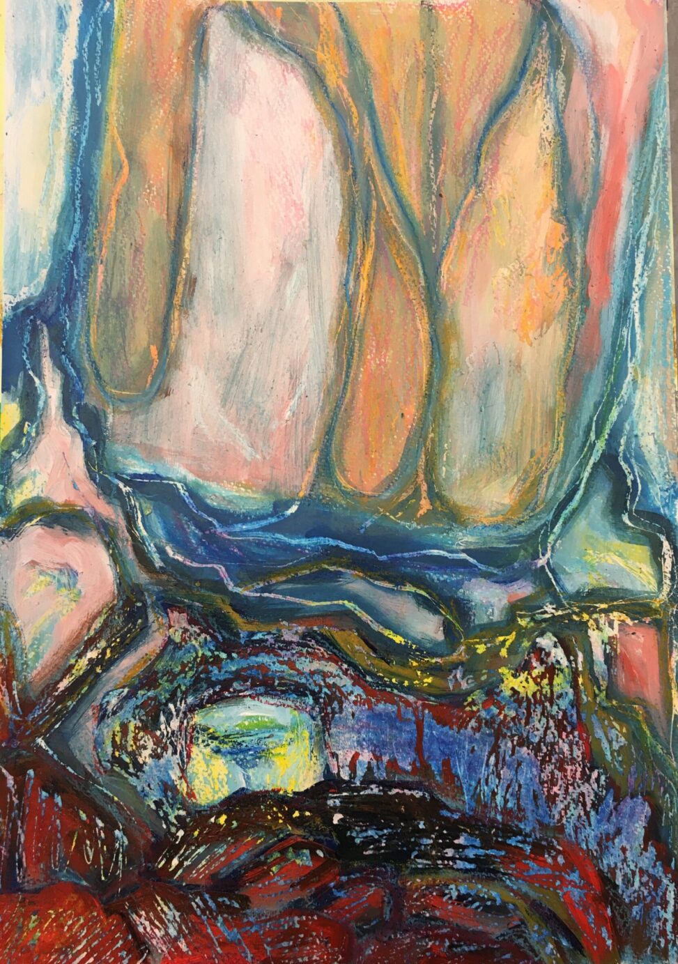
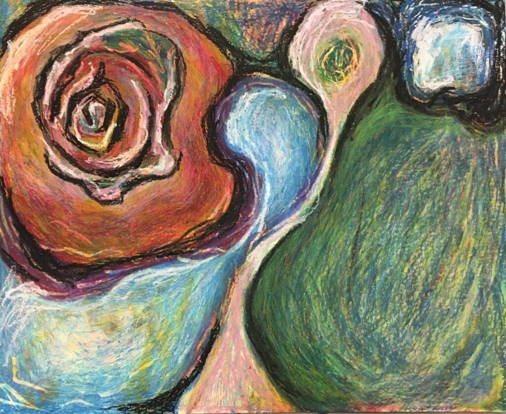
“Purell”
The filter inspiring this painting is a Purell hand sanitizer machine. I blocked in the basic shapes and negative spaces from the photograph and then worked with my materials until it felt like a compelling and finished piece. “Purell” is one of my favourites from this series because of the bright colours, high contrasts, and wild scratch marks. I am very excited about the miniature works found beneath the scratchings.
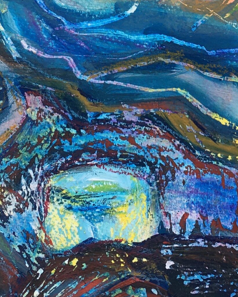
Detail Image of “Purell”
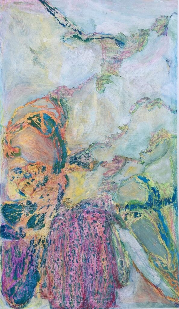
I was also quite excited with this piece, as I experimented with layering thick white paint on the pastels, blending it with faint pigments, and then scratching and peeling it off. This was fascinating because I had little control over the direction the paint peeled.
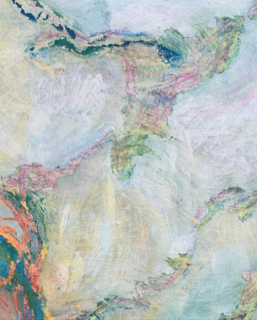
Detail Image
Personal Critique:
(I did this critique of my art in an earlier stage before revising it to the current pieces.
What 2 critique areas had the most success?
- Surface. The surface is very built up with many textures, glazes, scratches and marks.
- Risk-Taking. I was bold with taking risks by experimenting with layering the oil pastels and acrylic paint and scraping away the layers to reveal vibrant colours beneath. I made bold choices with my materials and did not worry about making mistakes. I wanted to see what the possibilities were.
- Colour.
What 2 areas are you struggling with?
- Professionalism. They do not look as professional as they could because I did not take the time to erase/paint over the excess pigment that escaped the tape frame. Also, I could have put more thought into the way that I hung them and I did not document them punctually
- Theory Integration. I didn’t relate the art too much of a theoretical topic, dialoguing with the text.
Leave a Reply